ShopDreamUp AI ArtDreamUp
Deviation Actions


Description
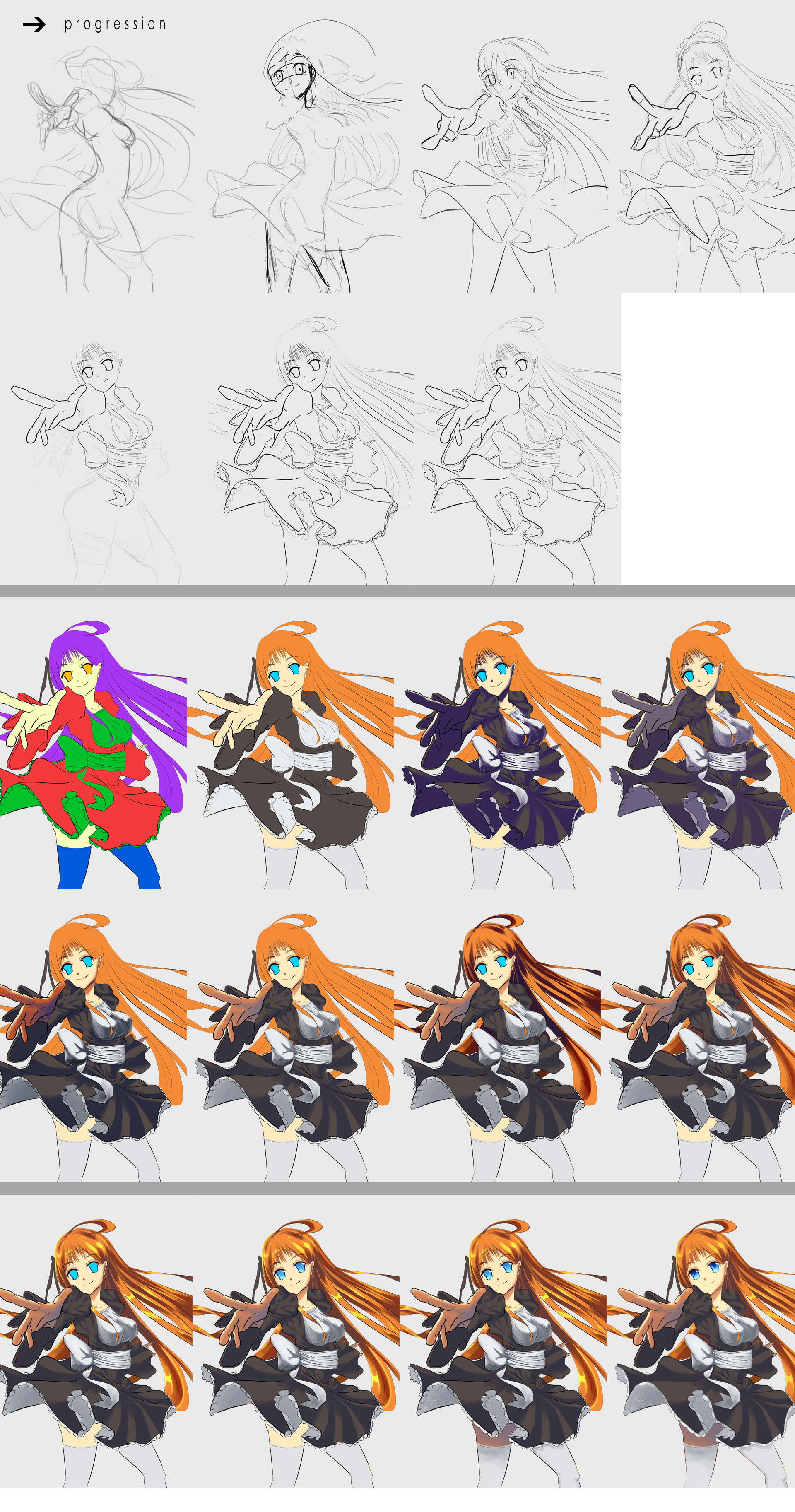
A progression for Practice 39 from sketch to end work. Feel free to ask any questions.
Details explaining work process will be below:
Sketching Step
Initial sketching started with a rough pose. I did not focus on anatomy or realism at this point, just tried to draw a loose, dynamic pose. After initial pose was made, adjustments were made for proportions and anatomy. The final sketch pose was very different from my initial pose as I ended up making a lot of changes due to my inability to properly draw out the kind of pose I wanted.
Adjustments continued even after pose was largely finished. This took several hours to complete as I was learning how this new pose worked as I drew. In the final sketch, I focused on getting the "outer" form of the clothes correct as I was planning on using shading to create folds instead of linework.
With inking portion, I aimed to try and get the lines as clean as possible. However, at the point of this practice, my control is still unsteady, so it ended up being quite messy. Not too much of a problem when sized down, but the messiness is noticeable because it gives your picture a "blurry, noisy" sort of feeling. I tried to implement some depth by varying line thickness, but didn't work very well either in this one.
Coloring Step
I tried a different coloring method this time, put together from findings from Practice 38. I used the polygonal lasso tool to block flat colors out. My brushwork is still messy, so I prefer using lasso to block colors. I use a random vibrant color to make it stand out from the lineart and background. This is so I can more easily see small gaps and missed areas between color sections.
I use a separate layer for each flat color so that I can manipulate it more finely in later steps. Even if one color layer is overlapped by another, I try to block in the whole form instead of letting overlap cover it up. This is so that I can have clean division between colors and also be able to select the blocked out part.
After blocking all the colors, I use Hue/Saturation to change the colors to what I want. Then, I started to block shadows on a separate layer. I used a low saturation dark blue as a general shadow color. I used the polygonal lasso tool to block out the shadows and then softened the edges manually with a round brush (opacity on pressure control). For the shadows, I focused on getting the "form" of the folds and the areas where overlapping parts would prevent light from getting through. I just picked a general lighting direction from the upper left to coordinate the shadows.
I also make sure to not make the shadows too complex or cover too large an area. Even if it would be more realistic one way, the intent is to keep the drawing from looking muddy, so there may be parts where you have to forgo shadows altogether. I set this layer to around 70% opacity to get a general view of the shadows.
Once I had my general shadows made, I locked the layer so that only the shadow layer is affected by brushwork. I then adjusted the colors with brushwork and Hue/Saturation to better fit the area where the shadow was being made. At this stage, I sometimes used two colors for a shadow to get more depth and complexity in the shading. But I tried not to use too many colors as this muddies the drawing.
I followed similar steps for the hair shadows. I kept the layers at 70% opacity and just adjusted the brightness if the shadow was too dark. Too low of an opacity and your shadow will have to be black to make any effect.
Coloring Step 2
In this next part, I added highlights to the hair with brushwork. This gets a similar treatment as the shadow layer, lower opacity and adjustments as needed on a locked layer. While doing the highlights, I also added some indirect lighting from the hair onto the clothes, the glow on white (because white is very reflective), and indirect lighting underneath the skirt. This ended up being very subtle, overdoing it would draw too much attention.
Towards the end, I added shadows to the area underneath the skirt. I then went around and looked for areas where shadow meets light. In this area, if you squint your eyes, you should be able to make out a third color that comes from the contrast. For example, if you have a dark reddish shadow on white skin, the third color will be yellow/orangeish. You can manually add in some color here to emphasize this transitioning point. I also added a very crude lace pattern underneath the skirt because it looked too plain.
I then worked on the irises. Using Burn and Dodge (or manual brushwork) to get the gradient effect. My intent with the irises is to have a "glass-like" look. So, I make the pupil quite large and dark with the round brush. I then add a low opacity white to get the glossy look and then full white for the eye shine. I also add a little sparkle inside to emphasize the "glass" look. This can be done with a tiny dodge brush or manual brushwork.
My last step after all the coloring is to duplicate and then lock the lineart layer. I then manually color the lineart to soften the "dark" look from black lines. I try to use a darker shade of the block color at the position of the line, so that the line is distinct, but also not too heavy. For areas in shadow, I leave the line black or use a very dark color. Aside from softening the drawing, coloring the lineart is also your chance to make certain elements more distinct and separated so as to minimize muddiness and blending of colors.
Final Step
After finishing the main coloring, I may add post-production for the final image. In this case, I used a gaussian blur layer on overlay (lower opacity) to make the colors a bit more vibrant and have a softer look. I also used high-pass filter on overlay to sharpen the overall image and then used the sharpen tool to manually sharpen some areas that had gotten too blurry. I also added a slight blur to elements in the rear to better emphasize depth.
Image size
1920x3652px 2.43 MB
© 2015 - 2024 maomuu
Comments2
Join the community to add your comment. Already a deviant? Log In
I love your coloring style, it's beautiful! It's really neat to see the steps you took, and also your explanation of each is very helpful! Thanks for the tips! 